Whether your brand is smart, funny, romantic, creative or whatever combination… it’s important that your brand SHOWS it. Numerous studies show that a first impression is formed within MILLISECONDS of the first interaction and your website visitors spend less than 8 seconds deciding if they’re going to stick around👀. And since personality is defined as a set of characteristics distinctive to you (or your brand)… it’s important that your brand identity and design show these characteristics so you can attract and keep ideal clients (or repel not-so-ideal) clients from the get go. Keep reading for 5 easy ways to pack more personality into your branding and do just that.

01. CONSIDER ADDING A PATTERN OR TEXTURE TO YOUR BRAND IDENTITY.
Not long ago my bestie IRL said that her son was in the store with her and saw something made of white marble. He told her that it “Looks like Mantha!”- meaning it looks like something Samantha would like. And he was right! I have white marble kitchen counters, bathroom floors, water bottles, you name it.
Adding patterns or textures to your brand identity is a great way to not only add more personality to your branding but can also provide a physical characteristic that you and your brand can be easily recognized by. Kinda like how if we spot a black and white striped shopping bag from a mile away we know it’s Sephora. That’s the awareness and recognition power pattern can play in your brand.
02. ADD MORE “YOU” TO YOUR BRAND PHOTOS OR IF YOU DON’T HAVE BRAND PHOTOS, GET THEM.
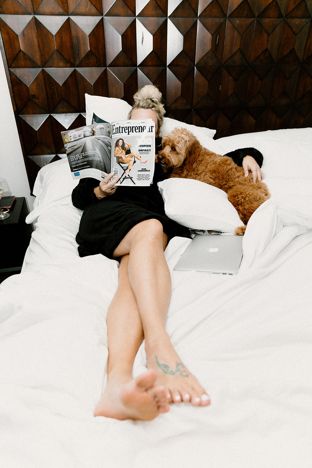
You might as well get used to me saying “Get brand photos!” on this blog, because I’ll say it A-LOT. Brand photos set you apart from all the stock-photo-using businesses out there and make you look more professional and relatable. Like, who wants to work with an obviously random stock photo character? No one 😎 .
But to be clear, by brand photos-I don’t just mean headshots. No, no, no. I mean get lifestyle, real deal pics that encompass the essence of Y.O.U. Are you always with your dog like me? Stick it in a brand photo. Is fun a brand value for you?… How do you have fun?… Show that in your brand photos.
My most favorite comments ever from my recent launch are from the header image on my about page where I’m flashing the “I love you” sign in sign language. People say, “OMG, this is so you!” and that’s exactly what you want if you’re trying to build a personal brand.
To this day, I wave it to my kids as we drop them off from school and even though I’m embarrassed now that one of the moms said, “I think it’s so cool you say ‘ROCK ON!’ to your kids everyday.” and she clearly doesn’t know it means “I love you”… I still do it, lol.
Anyways, what’s something people say you always do? How can you show it in your photos? What’s something you always have on you or near you? What does it look like to work with you? What do the end results of working with you look like? Show it all in your brand photos.
Ps. Want even more tips for brand photos? Make sure you download my free guide here for finding and creating a unique brand style- it’s packed with brand photo tips as well!

03. ADD ANIMATION TO YOUR WEBSITE.
There are so many forms of animation we can add to our website now to give our site more personality, the options really are endless. But my tip for this (and any of these 5 tips I’m sharing today, really) is to not just add something for sake of adding it, but rather try to pair the tip with one of your personality traits.
Here’s some ideas to get the creative juices flowing:
- If you have a funny brand, include memes and gifs as a form of animation.
- If you’re an adventurous travel photographer like my client and friend Jess, include video that shows the audience what that life looks like. See the video at the bottom of her site where the girl is riding off to the mountains on a moped?? So freaking cool, right? 😍😍😍
- If you’re a copywriter, consider adding the “typewriter effect” to your website where it looks like you’re typing.
Catch my drift? And even if you can’t pair the perfect animation with your characteristic traits, you can still add animation to breathe more life into your website.
If you’re a Showit user like me and my clients, play with the “transition” option in the toolbar or make your backgrounds parallax (where the text holds still while the background moves). It may not have anything to do specifically with one of your characteristic traits, but it will give your website visual interest, encourage longer user engagement, and set you apart from all the boring, non-animated sites out there.
04. ADD (OR GET SOME) “BRAND ELEMENTS”.
If I’m ever auditing a brand, this is one of the first things I look for and one of the most common things a lot of brands lack. This is a MAJOR piece of creating your brand identity and why I have a whole section dedicated to it in my freebie guide for you!
Brand elements are simply the unique visual aspects of your brand (outside your logo, fonts, and colors). They add serious visual interest, visually communicate your story, and give your readers tangible design elements to recognize you by across your marketing (even if your logo or name isn’t present!).
For example, in Cass’s branding, we included fun abstract shapes to represent the “imperfections” of her story, color blocking throughout her collateral to represent the colors of the rainbow and the visual representation of God’s promises her brand is all about, and one of my personal favorite brand elements of hers- cutout images of her and silhouettes of her products.
The use and combination of these throughout her marketing allows her audience to recognize a quote she posts is her post even without a full blown logo and reinforces the good news of God’s peace and hope that is possible for them.
05. Use different shapes.
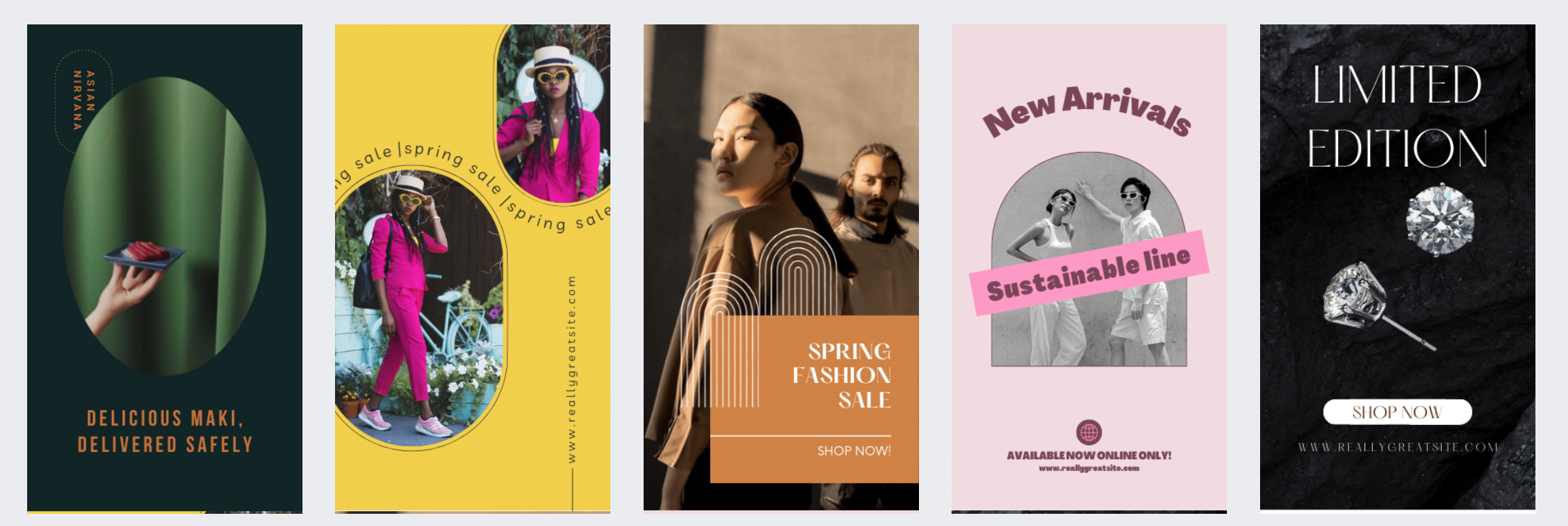
Another simple way to add more personality to your branding is to use anything-but-square-or-rectangle shapes throughout your branding.
If you’ve got a playful brand, try using circles for images in your social media graphics.
If you’ve got a retro style, swap out your square buttons for more rounded edge “squoval” buttons.
If you’re a boho kinda girl, give the trendy arch shape a try.
Shapes can be used in a variety of ways beyond images and buttons as you can see below from some free Canva templates just released.

Not sure which of these to implement into your existing brand or want to spruce up your brand without a full rebrand? I gotchu’. Apply for a design-in-a-day intensive with me and I’ll audit your brand, tell you what you need, and hand over the personality-packed designs in a single day flat. Two spots left in October- first come first serve 😎.
Keep it bold,

Comments +